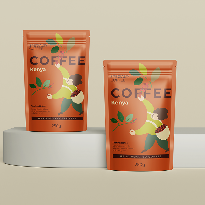
Ever grab a bag of coffee and think, “Wow, it looks nice—and it still smells good”? That’s coffee packaging design. It’s not just filling beans into a bag—it’s brains and fashion combined that tightens coffee packaging protection and coffee packaging looks. Whether you’re a roaster figuring out your next move or just love knowing what’s behind your brew, we’re cracking open the tricks that make these bags work. Want to see how they balance keeping coffee safe with looking sharp? Let’s dive in and find out.
What’s Coffee Packaging Design All About?
So, coffee package design—what’s the tea? It’s how coffee is dressed up to stay fresh and catch your eye. You know coffee’s a bit needy after it’s been roasted, right? Air, light, humidity—they’re all out to undermine it. Wonderful design steps in with bags that don’t hold back—conceived to save coffee and still strut some serious style.
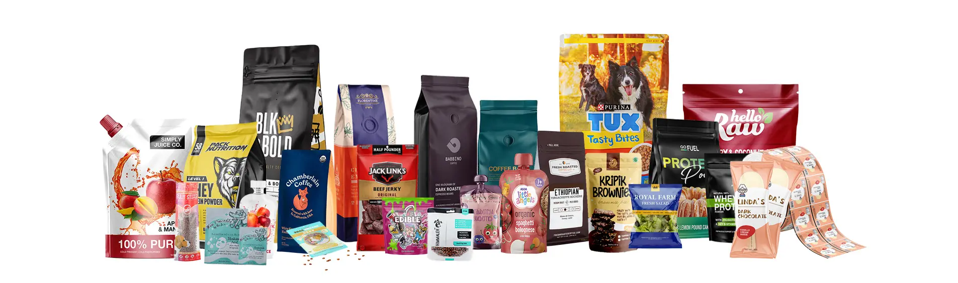
This is not one-size-fits-all. Small roasters need something quick and robust; big players want designs that scream their brand. You’ve got tough materials, sneaky ventilation, and show-stopping looks—all in one. It’s about keeping coffee fresh while making you want to grab it off the shelf. Want to know what makes it work? Bear with me.
Coffee Packaging Protection: Locking It Down
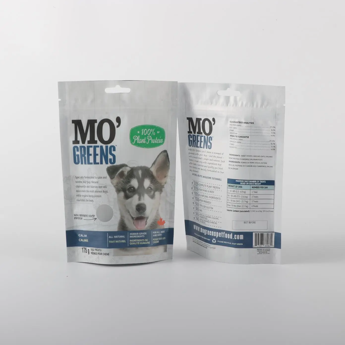
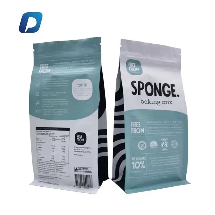
Let’s go to coffee packaging protection, because that’s where things happen. Coffee’s gotta be protected—shipping, store shelf life, or just sitting around in your pantry. A bag that can’t do that? Complete failure. Good design uses things like kraft paper—plain, tough, usually lined with something to keep water out—or mylar if it needs to be a tank.
And then there’s the extras. Degassing valves let that post-roast gas out so the bag doesn’t inflate—keeps air out as well, so no musty vibes. Seals? Zippers or heat jobs that don’t give up, even after a dozen openings. Oily beans need heavier walls to hold fast. It’s why your coffee’s still going strong when you brew it—protection that doesn’t slack.
Coffee Packaging Aesthetics: Making It Pop
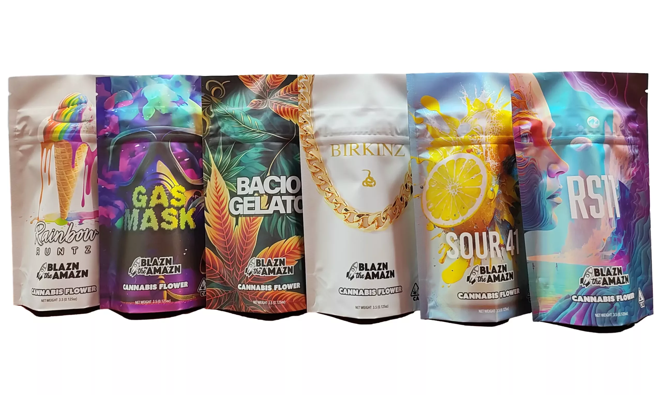
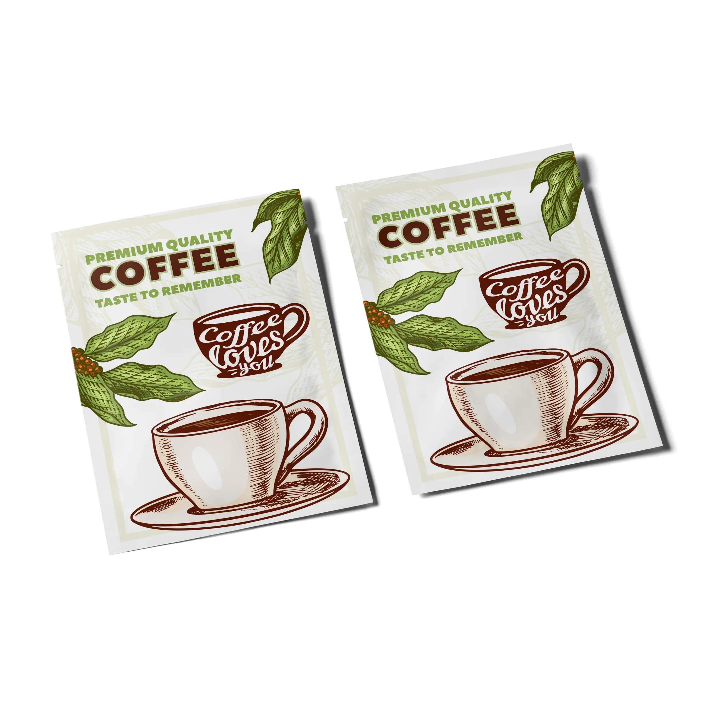
Now, coffee packaging aesthetics—this is the fun part. Ever pick a bag just because it looks cool? That’s design working its magic. It’s not just about holding coffee—it’s about selling it. Kraft gives that rustic, “I’m artisanal” feel; glossy mylar screams premium. Add a logo, some sharp colors, maybe a window to peek at the beans, and boom—you’ve got a winner.
The look of design must be as up as the attitude—earthy tones for micro-batch lots, graphic design for the logos. New-fangled printing options (like digital) make speedy changes in image possible—seasonal production, specialty blends, whatever. It’s how a few bags look like they burst off the rack—they’re being designed to do just that.
How They Pull It Off
So what’s behind this coffee package design? It’s grit and panache combined. Valves are not random—small masters permitting gas to escape, freshness to remain inside. Materials? Kraft’s cheap and tough, mylar’s a beast—some use both for the best of both worlds. Seals get sealed shut with heat or machinery, no leaks allowed.
And it’s not stuck in the mud—some of the bags are trying out cool stuff like freshness tags or quick-change prints. It’s about making a bag that’s protective like a pro and doing it with style—whether it’s a small pouch or a big stack.
Protection: The Heavy Lifting
Zooming in on coffee packaging protection—it’s the backbone. A bag that flops under pressure’s no good—shipping bumps, humid days, whatever. Kraft with a liner stops water cold; mylar laughs off tears. That valve’s a lifesaver—whole beans pump out gas like crazy, and without it, you’re toast. Ground coffee’s less fussy, but still needs a tight seal. It’s why that bag you’ve had a while still delivers—design’s got it covered.
Aesthetics: The Shelf Appeal
Back to coffee packaging aesthetics—it’s your first handshake with the buyer. Ever look at a bag and just know that it’s quality? That’s what we’re going for. Kraft’s got that natural look—add a matte finish to it, and it’s gold. Mylar’s shiny look says “top shelf.” Windows, bold lettering—little things that make it stand out. It’s why you choose one over another—looks that grab you before you even catch a whiff of the coffee.
What’s Next for Design
The future’s brewing some interesting things for coffee package design. Green’s the place to be—bags that break down but don’t let go are taking off. Some are going high-fancy—labels that tell you it’s fresh, prints that flip fast for new vibes. Protection’s staying tough, looks are getting sharper—it’s coffee bags growing, trick by trick.